
A complete, step-by-step breakdown of how I turned an AI dot-matrix city into a colourful canyon—with real-world ripped-paper depth.
By Arjen Roos – ArjenRoos.com
Why This Tutorial Exists
Lately people have been asking for another tutorial and it has been awhile since my last one So it’s time for an AI assisted artwork. Below is everything—from the exact prompt I fed the AI, to the Blend-If trick that makes the dots transparent, to the final upscale decisions (Magnific AI vs. Topaz Bloom vs. Gigapixel). Copy-paste it, experiment, and make it your own.
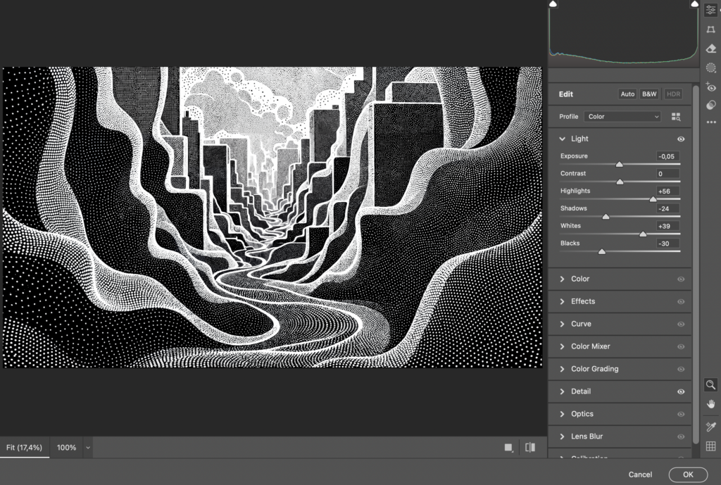
1 Generate the Black-&-White Stencil
Prompt
"A carbonpunk-themed image with intricate halftone patterns and textures resembles a detailed cityscape.
The award-winning design showcases elegant flowing shapes, subtle shadow play.
The minimalist colour scheme creating a visually striking and thought-provoking visual narrative."
Model: SDXL (I used Leonardo.ai).
Style: Black & white only.
Reason: We want crisp black shapes and white dots—colour comes later.
Save as: PNG to keep hard edges.
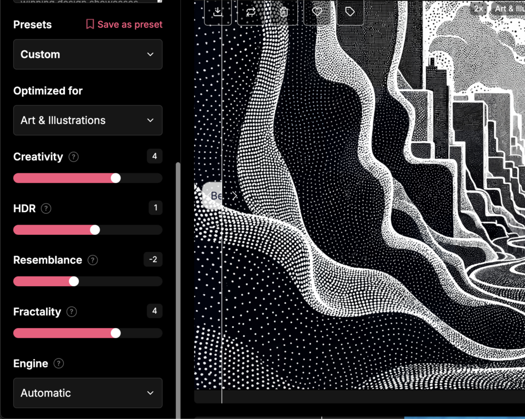
2 Super-Resolution Pass (Detail Mining)
I enlarge first so the stippled dots stay razor sharp during colour work.
| Tool | Settings I Used | Result |
|---|---|---|
| Magnific AI | Creativity 4, HDR 1, Resemblance -2, Fractality 4, Engine Auto | Three passes → 11 008 × 6 144 px (~68 MP) |
Why Magnific? At the moment the 39 €/mo plan suits my budget and lets me go higher than Bloom’s normal 64 MP ceiling. (Topaz Bloom Premium is temporarily testing up to 100 MP, which is great to see, but I’m watching the pricing first.)
Want the full Bloom-vs-Magnific showdown? Read my comparison here → https://www.arjenroos.com/topaz-bloom-vs-magnific-ai/
Low-Cost Alternatives
- Topaz Gigapixel AI or Topaz Photo AI faithful, non-creative enlargement. Read more about them here.
- Upscayl (free) – slower, GPU-friendly open-source.
What if your machine can handle the full-res file?
I worked on this piece in Photoshop on a 32 GB M2-MacBook Pro at the native resolution of 11008 × 6144 px. No lag, no crashes, and the brush response felt perfectly snappy. When your hardware keeps up, staying in the maximum resolution has one clear advantage: the master file already contains every pixel you’ll ever need. From that single PSD I export
- Web / socials → 2560 px (4 K) JPEG
- Standard prints → 7 – 12 K px TIFF (150–300 ppi)
- Gallery-size / XXL → full 68 MP TIFF
So the rule of thumb becomes:
If your computer stays responsive, work native.
If it starts to wheeze, down-scale for the creative phase
Resize it to 3840 × 2160 px (4 K 16 : 9) for screen and feel free to go larger if your machine allows..
Both workflows land in the same place; pick the one your hardware—and patience—prefers.
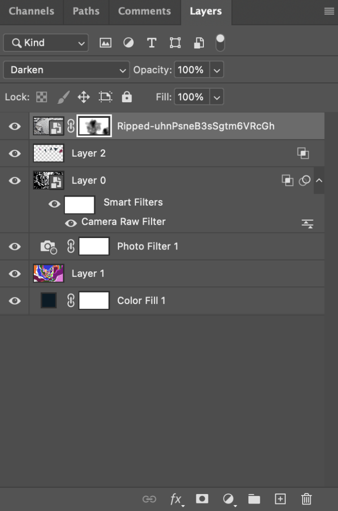
3 Photoshop Layer Stack
| Order | Layer | What It Does |
|---|---|---|
| ✦ Top | Ripped Paper Texture (Blend Mode : Multiply) | Real shadows from my Ripped Assets Pack |
| AI Dots PNG | The stencil we just upscaled | |
| Photo Filter | Global toning (Warming 85, Density ≈ 60 %) | |
| Colour Map | Blank at first—this is where we paint | |
| ▼ Bottom | Solid Black Fill | Safety net |
4 Making the Dots Transparent
- Double-click the AI layer → Layer Style.
- Under Blend-If : Gray
- Hold Alt/Option and split the WHITE triangle of Underlying Layer.
- Drag the left half to ~215, right half to 255.
- All black areas vanish; only white dots remain. Instant stencil!
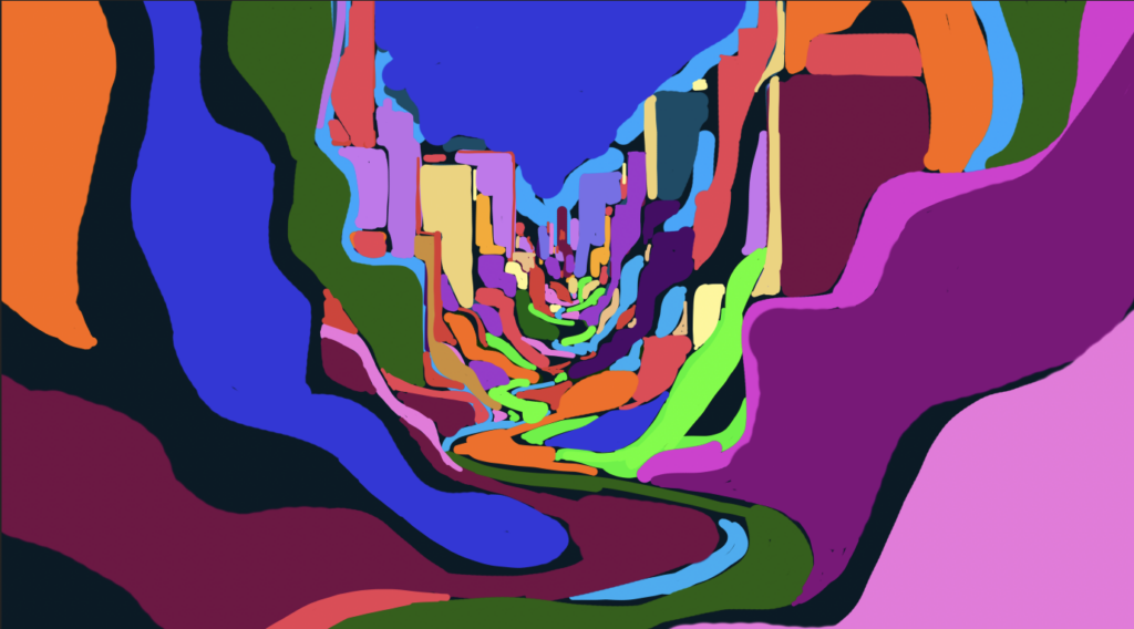
5 Hand-Paint the Colour Map
- Activate the blank colour layer.
- Use a 100 % hard round brush.
- Block-fill wild shapes that echo the canyon curves.
- Don’t aim for realism—think Fauvist.
- Don’t stress about staying inside the lines; the dot stencil on top will mask imperfections.
Shortcut: Lasso an area → Shift + F5 → Fill with foreground colour.
Palette hint: I went deliberately loud—pinks, limes, oranges—then cooled everything down with the Photo Filter until the hues felt coherent.
Because the AI dots sit on top, they mask ragged edges automatically.
6 Tone Harmony with a Photo Filter
Toggle the warm filter on/off. Warmth unifies loud hues; a cooling filter (#003C5B) flips the palette to neon-night.
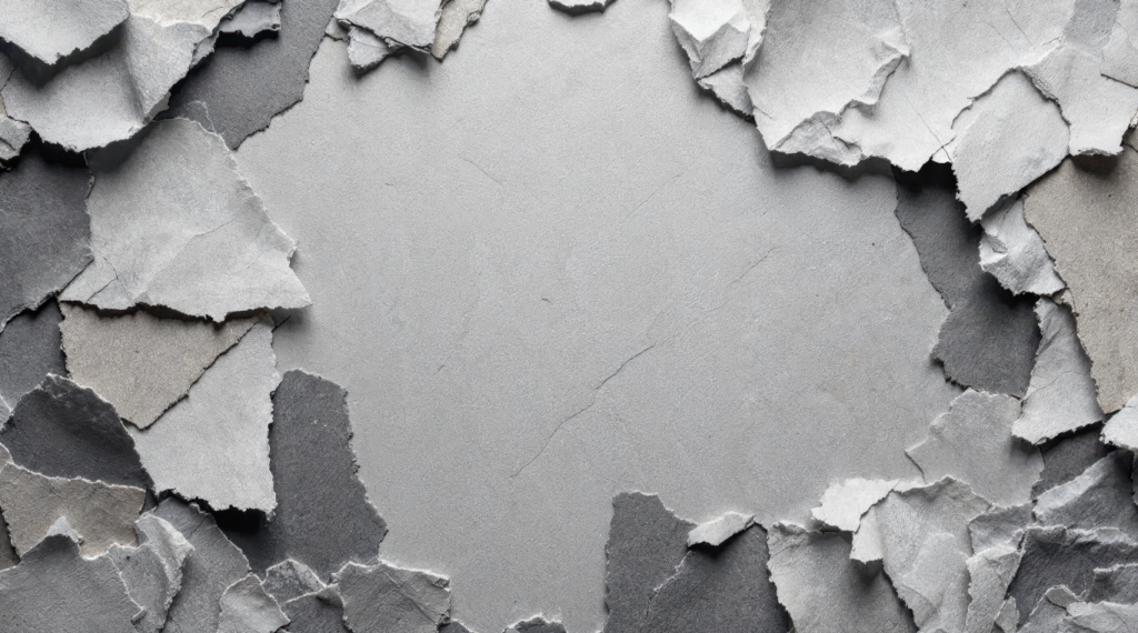
7 Add Paper Depth
I grabbed one of the high-res gray textures from my Ripped Assets bundle (125 PNGs, 2 GB of pre-torn paper).
- Place the texture at the top of the stack.
- Set Blend Mode → Multiply.
- Mask away anything you don’t need with a soft black brush on the layer mask.
Instant depth: the paper shadows dive into the painted colours, giving the illusion that the cityscape is shredded out of thick cardboard.
Don’t have the pack? You can scan torn paper on a flatbed, desaturate, add Levels for punch, and save as PNG.
8 Optional Polish
- Camera Raw Filter on the AI layer – Texture +25, Clarity +10.
- Add Noise – 2 %, Gaussian, monochrome to blend layers.
- Downsample Wisely – If you upscaled to 68 MP, resize to your print need (16-24 MP is plenty for 100 cm wide). Down-res keeps things pin-sharp.
9 Export
- Web – 2 560 px longest side, JPEG 80 %.
- Print – 300 dpi TIFF, Adobe RGB or sRGB (per lab).
Tag me @ArjenRoosArt if you post—would love to see what you build!
Quick FAQ
Q: Why not Topaz Bloom?
A: I love Bloom’s one-slider simplicity and image quality (see my comparison), but I needed 68 MP and Magnific handled that today at my cheaper tier. Bloom Premium is trialling 100 MP—so this is very promising.
Q: Isn’t three passes expensive?
A: It is. Magnific has no preview yet, so test small crops first. If budget is tight, upscale once to ~16 MP, finish the art, then run a single final pass.
Q: Do I need the ripped-paper pack?
A: Scan your own scraps if you like. My bundle (125 PNGs, 2 GB, € 6.99 and ofcourse supporting me) just saves time and includes commercial rights.
Supply List Recap
- AI generator (Leonardo.ai / SDXL)
- Magnific AI or Topaz Bloom or Gigapixel / Upscayl
- Adobe Photoshop
- Wacom/tablet (optional, for smoother brush curves)
- Ripped-Paper textures (DIY or my Gumroad pack)
Final Thoughts
Combining AI precision with messy, manual colour fills and tactile textures delivers a piece that feels both futuristic and handcrafted. CarbonPunk Cityscape is just one flavour—swap the prompt, change the colour map, drop in different paper tears, and you’ll have an entirely new series.
Happy creating—let the dots guide you!
— Arjen
(If this walkthrough helped, consider sharing the post or grabbing the Ripped Assets bundle to support future tutorials.)
Discover more from Arjen Roos Art
Subscribe to get the latest posts sent to your email.