ImagineArt 1.5 First Review: Can It fit my Art Workflow?
When a new AI image generator pops up, the first question I always ask myself is not “Is this fun?” but “Can this realistically improve my actual workflow as an artist?”
Over the past days I’ve been testing ImagineArt 1.5 – not because anyone asked me to, but purely out of curiosity. I wanted to see if it could take over part of the role that Leonardo.ai currently plays for me, especially for photorealistic work.
This is a voluntary first review. I’m not sponsored, and it’s absolutely possible that I overlooked certain UI options or hidden features. For example, it might well be that some kind of prompt-guided upscale exists and I simply didn’t understand the interface yet. What you’ll read below is my honest experience as a working digital artist trying to fit ImagineArt into a real production workflow.
If you want to try ImagineArt yourself, you can use my referral link:
(affiliate link – it doesn’t cost you extra, but it helps support my art).
What Is ImagineArt 1.5, in Artist Terms?
ImagineArt is an AI image platform that offers several modern models (Flux, Imagen 3, Seedream v4, Nano Banana and more) for text-to-image, editing and upscaling. The 1.5 model promises ultra-realistic results, better prompt understanding and more cinematic visuals.
A few things that matter from an artist’s point of view:
Multiple models, multiple looks – from highly realistic to more stylised, including Seedream v4, which is particularly good at painterly looks.
Image upload & editing – you can upload an image as a base and apply a new style or variation. (With my free account, image edits defaulted to Nano Banana, with the option to switch to Seedream Edit; I couldn’t access 1.5 directly for uploads.)
Upscaling – there’s a “classic” and “creative” upscale that can boost your image to high resolutions suitable for print.
Credit-based system – there’s a free tier with limited generations and paid plans with more credits and features.
On paper it’s a capable, modern platform. The real question is how it behaves when you approach it like a working artist rather than a meme generator.
Test Setup: How I Used ImagineArt
Hardware & OS: Apple computer (macOS).
Browsers: Brave and Safari.
Account type: free tier.
Aspect ratio: 16:9, 1 image per run for all tests.
Models:
ImagineArt 1.5 for pure text-to-image.
Seedream v4 Edit for image uploads.
I deliberately chose three types of tests that match how I actually work:
A cinematic Olafique-style hotel scene – to test photorealism and narrative portraiture.
An “impossible geometry” plaza – to see how it handles structured, architectural scenes.
A style-transfer of my own work (A Story in Yellow) – to test image-to-image and painterly rendering.
Test 1 – Cinematic Olafique Hotel Scene (ImagineArt 1.5)
Prompt 1: The hotel “lobby” that became a hotel room
My first prompt was aimed at my Olafique universe: a woman in a mustard coat in a slightly old-fashioned European hotel “lobby”, late evening, warm interior light against a cool blue exterior, subtle tension in her posture, inspired by narrative fashion photography (without copying any specific photographer).
ImagineArt 1.5 first test prompt (hotel lobby)
The result was technically excellent:
The lighting was spot on: warm lamps, cool blue outside, believable reflections.
The textures were convincing: wool coat, velvet upholstery, wood, glass – all felt real.
The depth of field matched the requested 35mm, shallow DOF, with foreground blur and a sharp subject.
However, the scene clearly read as a hotel room or suite, not a lobby. There was no entrance or reception area in sight, and the view outside was clearly from an upper floor, not the ground level you’d expect from most older hotels. Narratively it became a bit odd: a woman standing in what looks like a private room, still wearing her coat. Beautiful image, slightly broken story.
This already showed a pattern I would see more often: ImagineArt 1.5 nails the look but can be a bit loose with context.
Prompt 1b: Revised prompt, true lobby with revolving door
To fix that, I tried a revised prompt in Safari:
make it explicitly a grand lobby on the ground floor,
clearly show a revolving glass door with the street outside,
and add a reception desk with warm light and a bell.
Prompt 1b revised hotel lobby prompt
The new result was almost comically “perfect stock”:
A woman in the same mustard coat, now leaning against a polished wooden reception desk.
A revolving door opening onto a blue-hour European street at ground level.
Clean marble floor, classic lamps, everything exactly where you expect it in a luxury hotel.
Technically, it could be mistaken for a high-end stock photo:
No visible artefacts
Realistic materials and reflections.
Very solid composition and colour balance.
Artistically, it felt safe. If you need cinematic hotel imagery for a campaign, it’s ideal. If, like me, you often look for something more unsettling or layered, you still have to provide that yourself in the prompt or in post-production.
Test 2 – “Impossible Geometry” Plaza (ImagineArt 1.5 + Creative Upscale)
For the second test I used a prompt for a sunlit plaza full of interconnected staircases, arches and “impossible” geometry, with floating blocks in primary colours (red, blue, yellow) and small human figures as narrative accents.
ImagineArt 1.5 prompt 2 (impossible geometry)
Base image
The result:
A grand plaza with clean white architecture, multiple staircases and arcades.
Huge Mondrian-coloured blocks floating over the scene.
Small figures in dark clothing sitting or walking along the steps.
Clear depth, readable perspective, and believable lighting.
It’s a beautiful digital painting, but it’s not truly impossible. The space is ambitious, yet entirely buildable in the real world. Think “futuristic museum complex” rather than Escher-grade paradox. Again, ImagineArt plays it safe: strong composition, strong colours, but firmly within physical plausibility.
Creative upscale to 5120 × 2880
Next I ran the image through ImagineArt’s “creative upscale”:
The resolution jumped to 5120 × 2880, which is more than enough for serious prints.
Edges remained crisp: steps, railings and geometric forms stayed clean.
The overall look shifted slightly towards a polished 3D render – smooth surfaces, a bit less painterly texture than before.
ImagineArt creative upscale
What it didn’t do was introduce any new creative twist. Unlike something like Magnific or Topaz Photo AI’s Bloom mode, I couldn’t steer the upscale with a prompt or choose how adventurous it should be. It behaved like a very smart, high-quality enlarger, not like a co-creator that adds new narrative or texture.
For me that still has value – I can take a good base image and turn it into a print-ready piece in one click – but it’s not a game changer in the way prompt-guided upscaling can be.
This was the most interesting test for my own work.
I uploaded one of my images from “A Story in Yellow”: a young woman in a yellow dress standing in front of an empty classroom, with a man in a dark suit blurred in the background. The composition is important to me, as is the tension between the two characters.
ImagineArt’s image edit mode defaulted to the Nano Banana model, but I switched to Seedream v4 Edit and used this prompt (shortened):
Use the uploaded image as the base.
Keep the same composition, characters, poses, lighting and mood.
Do not add or remove anything.
Turn it into a high-end digital oil painting with visible brush strokes and canvas texture.
Preserve the strong yellow as the main colour accent.
The result honestly surprised me in a good way:
The composition remained almost identical: same positions of characters, desks, windows and lights.
The faces and body language stayed recognisable, avoiding the usual “AI drift” where people turn into different actors.
The painting style was convincing: visible brush strokes, subtle texture, softened edges and richer colour depth.
ImagineArt transform an upload into painterly style
It looked like a solid digital oil painting that I would absolutely consider printing as a separate variant of the piece. In terms of “photo/3D to painting”, Seedream v4 inside ImagineArt did an excellent job – arguably easier and more direct than what I often have to set up in Leonardo.
The limitation is that, at least on my free account, I couldn’t combine multiple reference images (content + style) the way I routinely do in Leonardo. I could tell it to “paint” my classroom, but I couldn’t say “paint it like this specific painter” via a second style image with a strength slider.
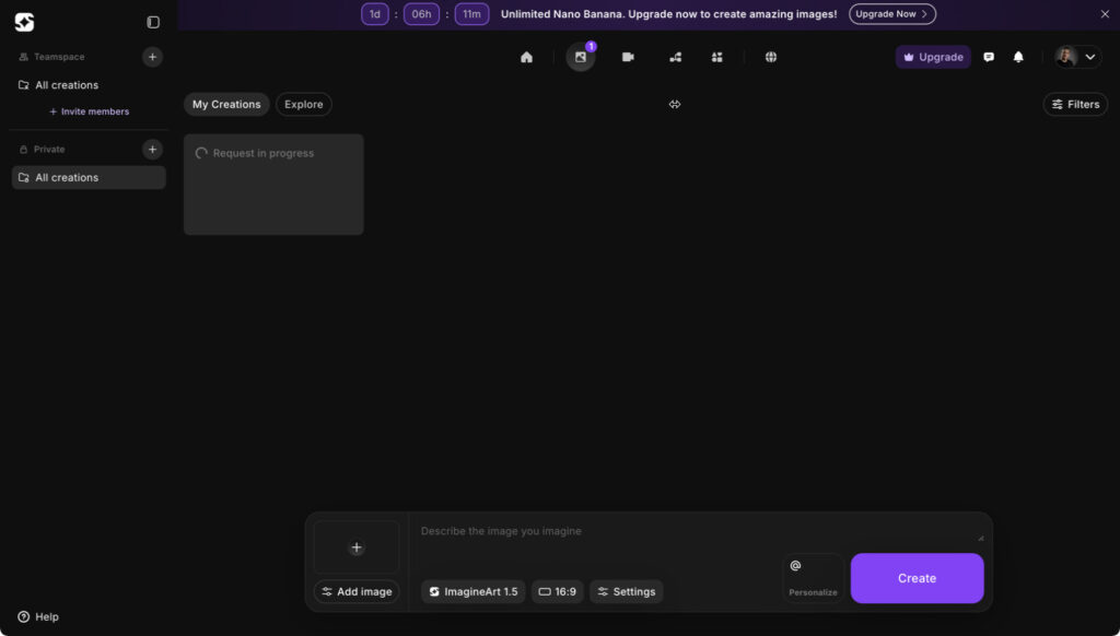
UX and Performance: The “Request in Progress” Problem
All of this testing exposed a pretty consistent UX issue on my setup.
On both Brave and Safari, my generations frequently got stuck on “request in progress” for 10–20 minutes.
In multiple cases, the image was in fact ready on the server, but the UI never updated.
Only after manually reloading the page did the finished image suddenly appear in my gallery.
ImagineArt user interface showing “Request in progress”
So from the system’s perspective, nothing was really failing – but from a user perspective it felt like the request was just hanging.
On a free plan this is not a catastrophe, but it does break the creative flow. When I’m exploring ideas, waiting 10 minutes with no feedback is simply too long. It also makes it harder to judge whether the delay is due to my browser, the queue system for free users, or a bug in the front-end.
For fairness: I didn’t test a paid account yet. It’s quite possible that subscribers get:
a higher priority in the generation queue, and
a more stable UI experience.
But based on the free plan alone, I’d call the UX promising but flaky: great image quality, uneven feedback.
How It Compares to Leonardo.ai in My Workflow
Right now Leonardo.ai is still the backbone of my AI workflow, and that hasn’t changed after testing ImagineArt.
What Leonardo gives me that ImagineArt does not (yet):
Separate content, style and character uploads
I can upload a base image for content, a second image purely for style, and sometimes a third for character consistency.
Control over influence
I can dial the influence of these images from low to max with sliders, which is crucial when I want to keep composition but drastically change style.
Complex style mixing
For example, I can upload my Story in Yellow classroom as content and a Picasso painting as style, then blend them into a Picasso-like version of my scene with controlled strength.
That kind of control is exactly what I need for non-standard, narrative and experimental work – the kind of pieces where I don’t want “perfect stock”, but something slightly broken, tense or surreal.
ImagineArt does offer ‘character’ options and encourages you to run most edits through Nano Banana, which can change style and mood quite effectively from a single upload. For many users that’s probably exactly the right level of complexity. In my case, however, I prefer the more modular approach in Leonardo: separate uploads for content and style plus a prompt on top. That kind of control is still hard to replicate in ImagineArt, even though I can see Nano Banana evolving in that direction in the future
Where ImagineArt impressed me:
Straight photorealism
In my personal opinion, its raw photorealistic output (especially from ImagineArt 1.5) is at least on par with, and sometimes better than, what I get from Leonardo’s Lucid Origin engine when I’m aiming for classic photorealistic scenes.
Photo-to-painting conversion (Seedream v4)
The classroom oil painting edit was one of the cleaner, more believable “photo to digital painting” conversions I’ve seen.
Clean architectural and environmental renders
The geometric plaza shows how well it can handle structured spaces and bold colour blocks without falling apart.
So for me the current balance looks like this:
Leonardo.ai – my main tool for complex, multi-image driven, non-standard art where I want maximum creative control and style mixing.
ImagineArt 1.5 / Seedream v4 – a very useful extra engine when I need ultra-clean photorealism, a quick cinematic scene, or a convincing painterly version of an existing piece.
Who I Would (and Wouldn’t) Recommend ImagineArt 1.5 To
Based on this first review, here’s how I see it:
I would recommend ImagineArt 1.5 to:
Designers, agencies and content creators who often need high-end, stock-like images: cinematic hotel lobbies, realistic portraits, polished architecture, etc.
Artists and illustrators who want fast, realistic bases they can integrate into mixed media pieces (for example, using ImagineArt for backgrounds or elements, then combining them with 3D renders, photography and painting).
Photographers and digital painters who are specifically looking for a good “photo to painting” conversion without diving deep into multi-image pipelines.
I would not replace Leonardo.ai with ImagineArt if:
Your work relies heavily on multi-image conditioning (content + style + character).
You need fine-grained control over how strongly each reference influences the result.
You enjoy pushing models into weirder, less standard territory rather than producing clean, client-ready images.
For my own practice, ImagineArt won’t replace Leonardo – but it has earned a spot as a specialist: the place I go when I want beautifully clean photorealism or a quick painterly reinterpretation of a scene.
Final Thoughts (and a Reminder)
This has been a “first review”, focused specifically on the parts of ImagineArt that matter to me as a digital artist who mixes photography, 3D, AI and painting. I tested a subset of features on the free tier, and there’s a good chance some UI elements or advanced options escaped me. If there is a hidden prompt-guided upscale mode, for example, I simply didn’t find it yet.
What I can say with confidence is this:
The image quality is genuinely strong – often stronger than many renders I see from other platforms.
The UX still needs polish, especially around progress feedback and free-tier performance.
For artists like me, it’s an excellent additional tool, not a full replacement for more flexible engines like Leonardo.
If you’d like to try it yourself and see how it fits into your own workflow, you can use my referral link:
If I discover more advanced features or find ways to integrate ImagineArt more deeply into my mixed media process, I’ll probably follow up with a “second review” – this time with a paid account and more long-term projects.
Related
Discover more from Arjen Roos
Subscribe to get the latest posts sent to your email.